Concept & Process
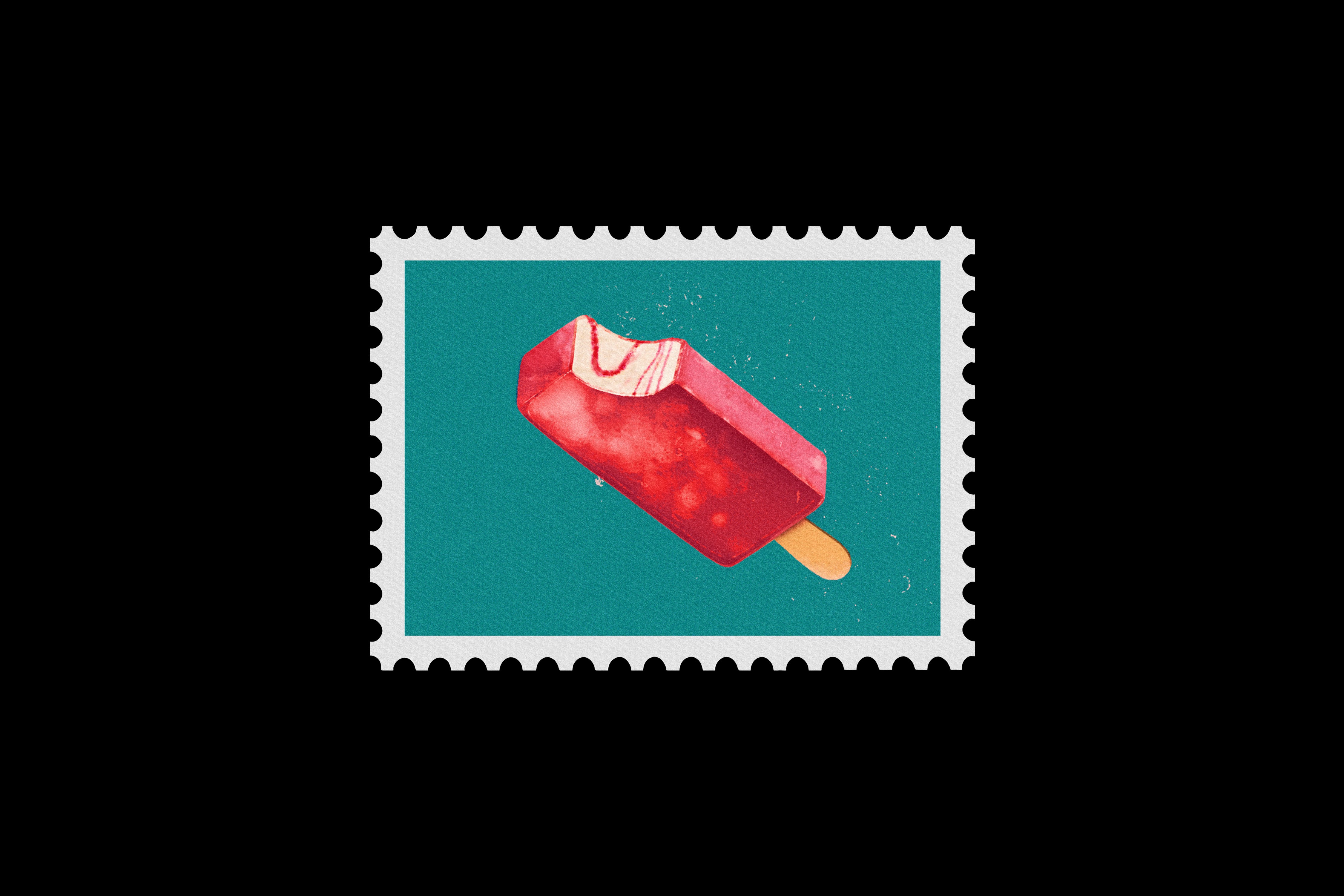
The project began with an original illustration of a strawberry ice pop, which became the starting point for developing the overall visual direction. The concept was inspired by the bright, nostalgic feeling of summer and the simple enjoyment of an ice pop on a hot day. So I experimented with strawberry imagery, bold typography, playful graphic elements, and Y2K-inspired visuals to build a youthful and energetic advertising style.
Concepts
The final three designs explore different interpretations of the same ice-pop concept: a bright summer direction, a beach and ocean-inspired direction, and a playful freezer/winter direction. Each variation uses its own atmosphere and visual language while maintaining the strawberry ice pop as the central element of the campaign.
Outcome & Reflection
The final design combine playful typography, strawberry imagery, and layered textures to create a colourful summer-focused campaign. The project allowed me to explore how nostalgia, product imagery, and graphic design can work together to create an engaging advertising concept.