Brief to Launch
The objective was to create a personal album cover design for an album surrounding a KNIGHT
A conceptual album cover exploring the journey of a solitary knight towards an unknown destination, reflecting themes of loyalty, purpose, and the uncertainty of what lies ahead.
The design needed to establish a strong visual identity that could work as both a standalone album cover and a physical music product.
Exploring the Visual Direction
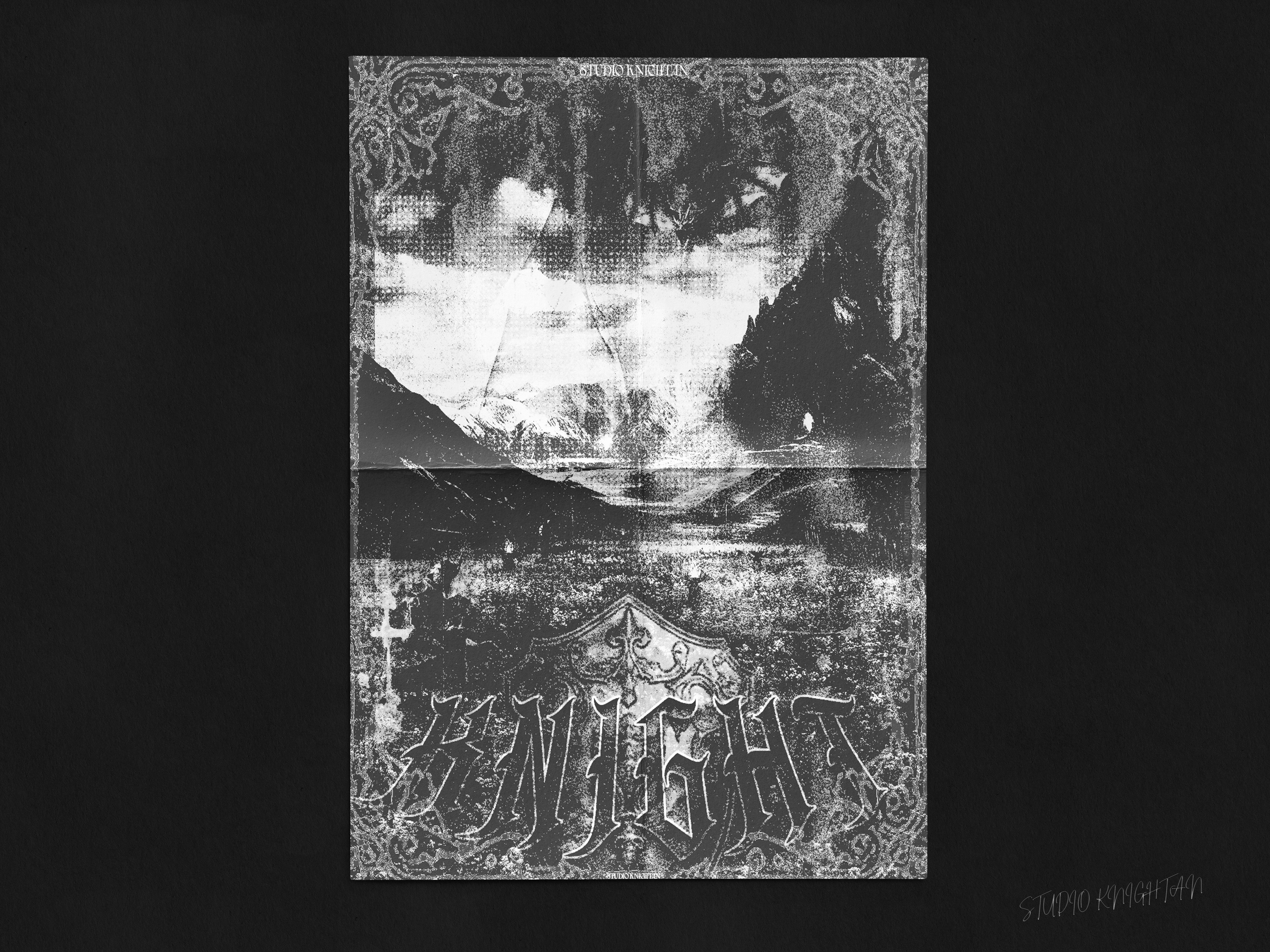
The visual direction combines a textured landscape with a dark blue and black colour palette, creating a moody and atmospheric composition.
The large, condensed KNIGHT typography establishes the main focal point, while the handwritten script introduces a contrasting, more expressive element.
The decorative border and distressed texture add a vintage, tactile quality to the artwork, creating a connection between the landscape imagery and the physical nature of a vinyl or album cover.
Design
When designing the image I wanted to make something that felt atmospheric, and grunge like, centered around the/a Knight. An almost medieval inspiration. I used to photo manipulation to create this scene.
The background consisting of mountains, fog and a dragon in flight.
The midground containing a path/bridge leading to an entrance, and on the right an entity watching from the side.
The foreground contains a field of grass, and a path of lights , which the knight traverses his way through.
Cover to Physical Application
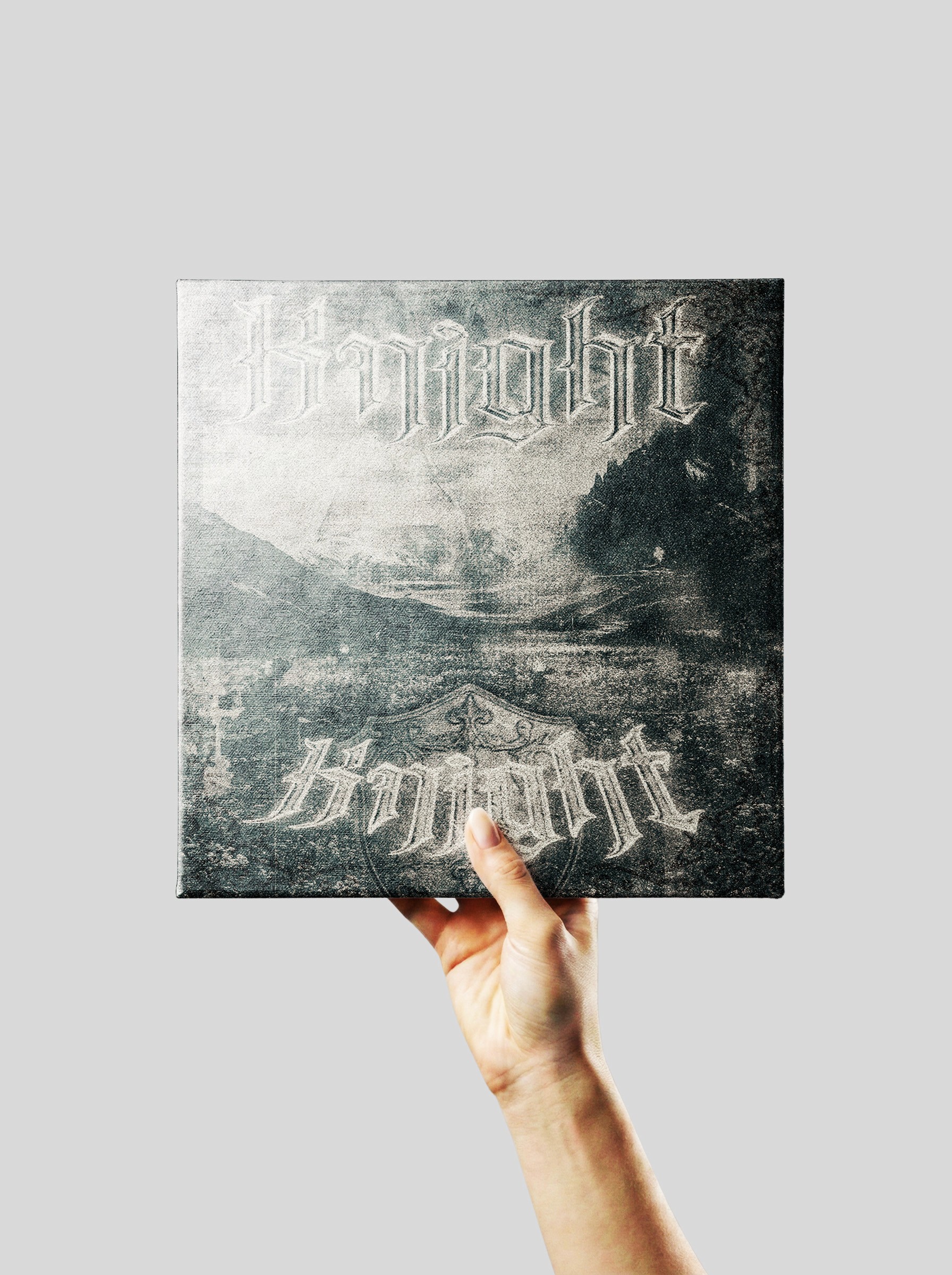
The artwork was then explored as a physical music product, showing how the design translates onto a CD case and how its visual identity can be carried across different formats.
The contrast between the large typography and the atmospheric background helps maintain the cover's identity when applied to a physical product.
Outcome
The final album cover presents KNIGHT through a combination of expressive typography, atmospheric imagery, and a textured visual treatment.
The design creates a distinctive identity for the music release, while the physical application demonstrates how the artwork can extend beyond a flat composition into a tangible music product.
The project explores how a music cover can function as more than packaging, using visual storytelling to establish a mood and create a memorable identity for the release.