THE IDEA & PROCESS
Brief to Concept
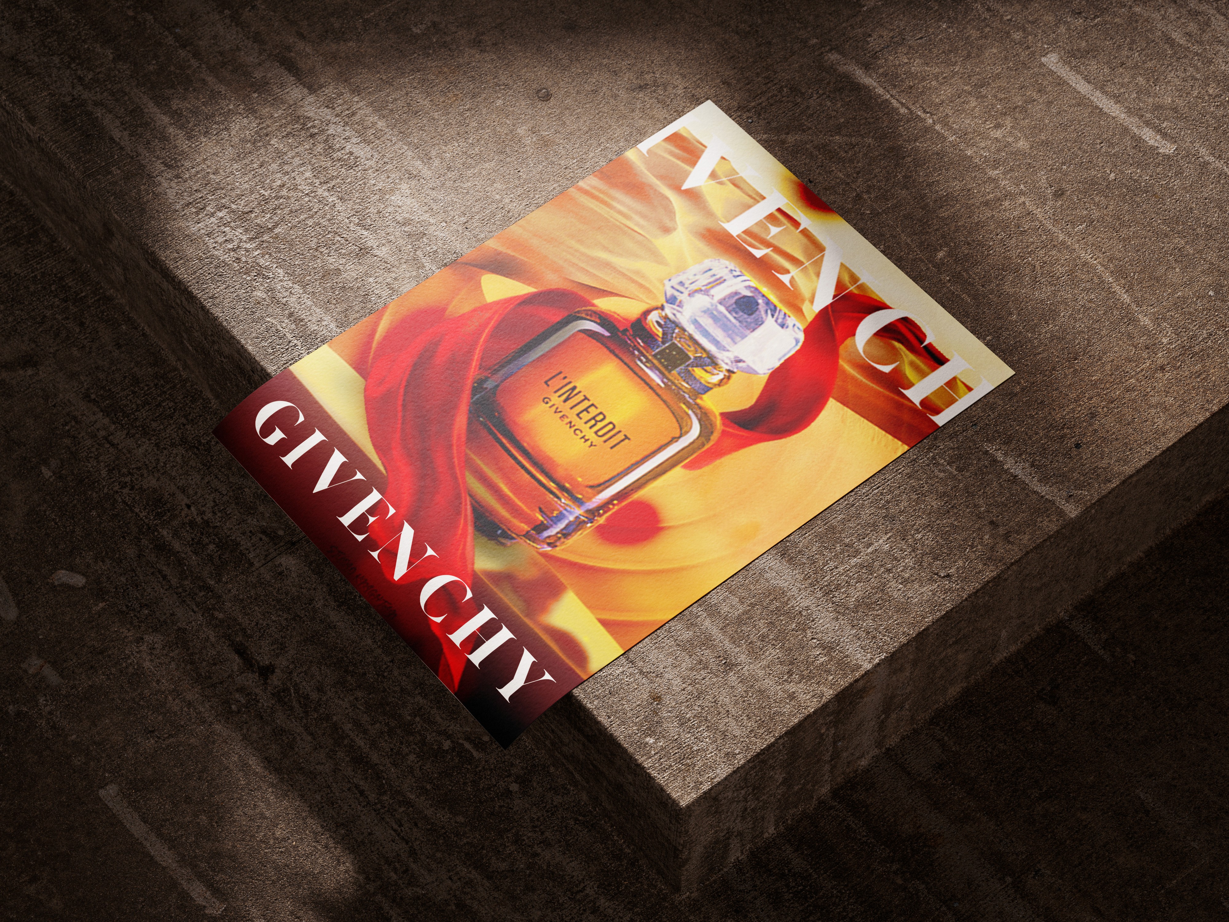
The objective was to create a promotional advertisement for Givenchy L’Interdit that would place the fragrance at the centre of the composition while giving the product a strong visual atmosphere.
Rather than presenting the bottle in a simple product shot, I explored how colour, movement, and abstract forms could be used to make the advertisement feel more expressive and visually striking.
Visual Development
When designing this, I wanted the visuals to suit the overall environment. So I wanted to use warm colors and experimented with warm reds, oranges, and creams.
I explored different backgrounds and wanted something earthy or in relation to earthy tones. I choose the Sahara/desert to incorporate. There after I wanted the product to be on something so I created a platform from which it could be shown.
To introduce some movement into the design as well I added flowing shapes and layered imagery around the bottle, while keeping the product as the primary focal point.
The composition was developed around contrast: the structured form of the fragrance bottle against the softer, more fluid elements surrounding it. This helped create a sense of depth while giving the advertisement a more editorial feel.
THE FINAL OUTCOME
Final Design
The final composition uses the L’Interdit bottle as the central focal point, surrounded by warm abstract forms that create movement and visual depth. The strong red and orange palette gives the advertisement an energetic presence, while the lighter tones provide contrast and prevent the composition from becoming visually heavy.
Typography was kept minimal, allowing GIVENCHY and the product itself to remain prominent. The landscape format also gives the composition a broader advertising feel, allowing the surrounding imagery to frame the bottle rather than compete with it.
Outcome & Reflection
The result is a bold promotional piece that combines product advertising with a more artistic and editorial approach. The project allowed me to explore how composition, colour, imagery, shadows & highlights and product placement can work together to create an advertisement that communicates a feeling rather than simply presenting the product.